Tiffany & Co forever has used that distinctive blue color for their packaging and for the first time I saw it used in an online ad.
This new line of key pendants they created are simply beautiful, and very with the current jewelry and design trend. Keys are very popular right now (at least I keep seeing them everywhere!). Lovely aren't they.
Nov 23, 2009
Oct 30, 2009
Bravia Commercial is Bliss
Has anyone seen this commercial for Bravia? If you haven't you are in for a serious TREAT! Check it out. Its such a beautiful & innovative way to promote a product that's all about the visual.
Oct 29, 2009
Fabulous Wallpaper
There's a small shop in MA that creates some of the most beautiful wallpaper I've ever seen called Nama Rococco. They only have a few lines, but I think all of them are excellent.

Everything at Nama Rococco is hand painted and hand screened. Amazing! The detail and hard work that must go into every order makes me want to get enough to paper my whole house.
As I think about what I want to do in the last bedroom in our house to be designed (bitter sweet) I think about wallpapering just one wall. I want it to be a neutral color with pops of color, similar to these.


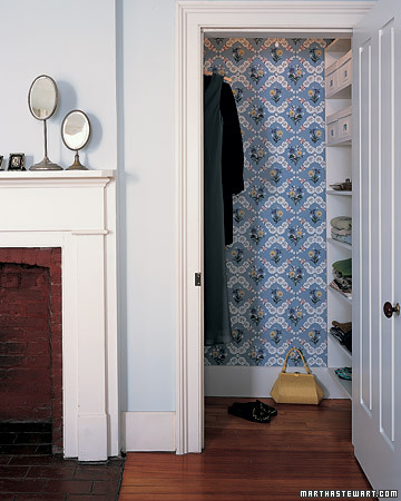
Or maybe doing some splash of pattern/color in the closet, I like that idea a lot.

Perhaps I'll use this couture line of Nama Rococco's paper. Oh the choices!


Everything at Nama Rococco is hand painted and hand screened. Amazing! The detail and hard work that must go into every order makes me want to get enough to paper my whole house.
As I think about what I want to do in the last bedroom in our house to be designed (bitter sweet) I think about wallpapering just one wall. I want it to be a neutral color with pops of color, similar to these.


Or maybe doing some splash of pattern/color in the closet, I like that idea a lot.

Perhaps I'll use this couture line of Nama Rococco's paper. Oh the choices!

Oct 26, 2009
Art:21 is Back!

For those of you who haven't yet experienced Art:21 yet, I suggest you get on it! Their 5th season premiered at the beginning of October, and what a season. Artists like Baldessari, Doris Salcedo, William Kentridge, Mary Heilmann, Paul McCarthy, and my personal least favorite, Jeff Koonz. (I do dislike Jeff Koonz, but these other artists are near and dear to my heart, some I have met, some I've written on for exhibition catalogues...they are wonderful!) These documentaries about artists living and working in the 21st century has some of the most accessible explanations of contemporary art anywhere. The format is simply Q&A with the artist, but the care and thoughtfulness put into their answers, as well as the editing done to the footage, creates a succinct and very understandable look into their artwork. What a feat, knowing what the majority of people's responses are to contemporary art, it is quite an accomplishment to make it accessible to the public like this. Kudos to Art:21 to be sure.
But good news is still to come, if you're like me and have never been able to figure out when they actually air where you live, then I have some good news. Now PBS has put every episode of all 5 seasons up on their website! Click here to watch, and enjoy!
Oct 9, 2009
I love you Eames, but why are your designs so expensive?
I love Eames design. If I had all the money in the world, I'd put something of his in every room! In fact, once upon a time, I had an Eames chair.

But alas, my mother gave it away because it was in her garage too long. So sad.
Anyway, Eames. In my office I'd put the swag leg desk.

And in my entry way, I'd put this lovely coat rack.

And of course, for relaxing in the family room, I'd put this wonderful recliner.

It's too bad all things cost upwards of $5,000! I'll just have to settle for knockoffs until I come into some serious money. :)

But alas, my mother gave it away because it was in her garage too long. So sad.
Anyway, Eames. In my office I'd put the swag leg desk.

And in my entry way, I'd put this lovely coat rack.

And of course, for relaxing in the family room, I'd put this wonderful recliner.

It's too bad all things cost upwards of $5,000! I'll just have to settle for knockoffs until I come into some serious money. :)
Oct 1, 2009
Facelift for the Bedroom
Josh & I endeavored to redecorate the second bedroom in our house this summer.
It wasn't a remodel, just a face lift with some paint, curtains, bedspread, lamps and wall hangings. I love the colors we chose (indigo for the back wall) and a light (not baby) blue, kind of a cornflower blue.
And the 'headboard' is just a giant vinyl sticker. I ordered it on Etsy which is actually where I got a lot of the things in this new bedroom (love that site!). It was not that expensive and beats buying a brand new headboard. I bought it from Leen The Graphics Queen.
But, my favorite thing about this room is the paper that I framed on one wall. It is an amazing blue (with hints of purple and green) hand marbled paper imported from France. Isn't it gorgeous!?

Kaleidoscope?
So my best friend and I have been going back and forth about starting a blog, so here I am, just giving it whirl. I never started blogging before because I kept thinking, who would read things I want to write about? So, to you who are reading, thank you! :) You're probably thinking why did she name her blog kaleidoscope? Mostly because I couldn't think of a witty phrase/jingle that encompassed all the things I want to talk about. But also because I love the word kaleidoscope.
Not to get all...when I was a kid on you...but when I went to summer camp as a kid, our counselors used to name themselves something, example, my counselors were kit-kat and crutch. I always used to think to myself, if I'm a counselor I'll have a much cooler name then those. I thought about it on and off for years and finally about 10 years ago, decided I would be kaleidoscope. From that point, I grew to love so many other things about kaleidoscopes: the colors, their changing patterns, good clean visual fun!
Essentially this blog is going to be about anything and everything that intrigues me, which are mostly things like art, art history, design, color, pattern, interior design, paper, hand made things, architecture and so much more. I hope you enjoy, and just to start us off, I've included a few beautiful kaleidoscope images. Who doesn't love these!?


Subscribe to:
Posts (Atom)


